
Deep: Homepage UX Explored
How the world's top tech companies are designing homepages in 2026. 20+ examples from Stripe, Linear, Notion, Apollo, Ramp and more.
DoP Deep is deep analysis which explores how the world’s top teams handle everything from payment UX to AI agents, gamification to navigation - with practical examples you can use for your own product. New Deep Dive reports every month.
In just the past few weeks, top tech companies like Stripe, Linear, Notion and others have all released new homepages to much fanfare. Notion caused a stir by positioning its AI Agents as human replacements that work night shifts while Linear re-structured its entire homepage around its human / agentic approach to software development, embedding live widgets that bring each step of the process to life.
It’s fair to say that for some companies, as AI transforms their value proposition, they’ve been scrambling to update their homepage to ensure it reflects their new offerings.
And it’s not just the messaging that’s changing on homepages. The rise of AI tools means we’re increasingly seeing design teams think creatively about the types of components that matter on homepages in 2026.
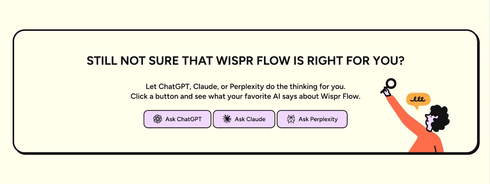
For example, this is a new type of component from Wispr that is slowly gaining adoption by other companies, too. It allows visitors to a product homepage to get an AI summary of the core value proposition in tools like ChatGPT, Claude and Perplexity:
In this Deep Dive, we’ll take a look at over 20 different homepage designs together from leading companies like Stripe, Linear, Notion, Square as well as newer emerging products that were recently featured in the 2026 SaaS trending report like Granola, Paper and others.
For each homepage, we’ll explore design components of interest, hero images, languages, AI positioning and more.
If you’re currently considering how to position your own product and its AI features on your homepage or are just curious about how other companies are designing their homepages in 2026 then this Deep Dive should help.
Coming up:
20+ homepage examples from Stripe, Linear, Notion, Cursor, Ramp and more with downloadable examples for each - including why some of them are already setting a new benchmark for the industry
Why one company removed almost every CTA button from its homepage and what it replaced them with instead
How AI and AI Agents are transforming homepage design choices
The 3 distinct hero headline patterns the world’s top SaaS companies are using right now, the specific words they’re choosing; with full analysis of the language used across all homepages
Color analysis mini app to understand what color palettes and copy companies are using on their homepage that you can use for your own product’s design.

How this Deep Dive analysis is structured
This Deep Dive includes over 20 different homepages from top companies with a breakdown of core components, design styles, language and CTAs:
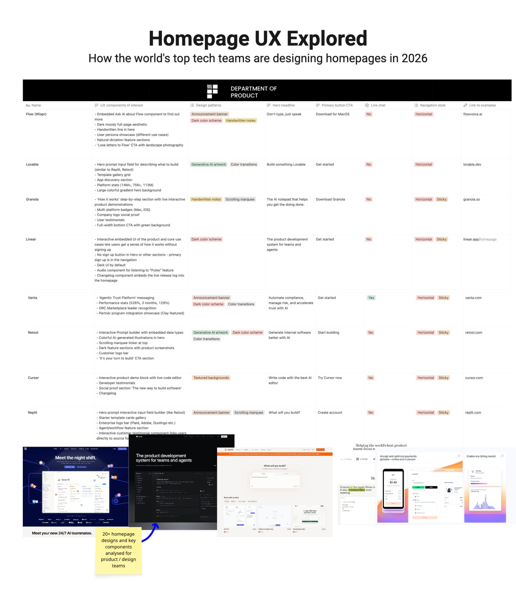
The analysis breaks down each homepage across filterable dimensions including:
UX components of interest - a curated set of design components that are notable and worth knowing about in 2026. For example, Linear’s embedded product demo that works without signing up. Replit’s hero prompt input. Stripe’s live expandable modals.
Hero headline - the exact words, as written for each of the homepages. Punctuation and casing included, because both are deliberate. Granola’s “get the doing done” and Notion’s “Meet the night shift.” are very different strategic choices, and seeing them side by side is the point.
Primary and secondary CTAs - The text label on the most prominent call-to-action buttons. Differences here reveal whether a team is optimising for volume (low-friction sign-up) or qualification. For example, Ramp uses “Get started free”; Flow (Wispr) uses “Download for MacOS”.
Sign-up options - which authentication methods are surfaced on the homepage itself: email, Google, Microsoft, or a straight download. Useful context for anyone thinking about their own onboarding defaults.
Design patterns - dark colour schemes, announcement banners, generative AI artwork, scrolling marquees, colour transitions, textured backgrounds, and more. Filterable across the whole set.
Color and language analysis
As well as design components and patterns, we’ll also take a look at the color palettes and language used across each of the homepages to identify new trends and styles:

New homepage components of interest
Let’s start by exploring some of the new homepage components of interest.
There are some new, emerging patterns here that change the idea of how a homepage can bring a product’s value proposition to life and a new component designed to drive conversions that feels a little aggressive but very powerful in the AI era.