DoP Deep - Payment journey UX explored
How companies like Dropbox, Notion, Perplexity, Zoom, Spotify and more take payments
🔒DoP Deep goes deeper into the concepts and ideas that are covered in the Weekly Briefing to help you learn lessons from the experiences of top tech companies. If you’d like to upgrade to receive them you can do so below. Or you can find out more about what you get as a paid subscriber here.
Hi product people 👋,
It was recently reported that Uber is experimenting with a new payment feature that allows via bank transfers using Stripe’s Link functionality. And in its conference last week, Stripe revealed that crypto payment methods are back. For product teams, the payment methods and gateways you choose can have a dramatic impact on conversion and retention and so we thought this might be a topic worth diving deeper into.
In this DoP Deep dive, we’re going to explore in detail the payment journeys of top tier companies including attributes like the payment methods they offer, button CTAs, the number of steps in the journey and more.
If you’re working on a payment journey of your own or you’re thinking about some of the ways you might be able to optimise your journey, this should hopefully come in handy.
Coming up:
A deep dive into the payment journeys of top tier products including: LinkedIn, Spotify, Zoom, Notion, Perplexity, Docusign and others
How to design a modern payment experience - lessons and takeaways for product teams looking to optimise their own payment journeys
How new payment methods like Stripe’s bank transfer works and the emergence of new payment methods
All payment UX patterns and journeys in full

How this analysis is structured
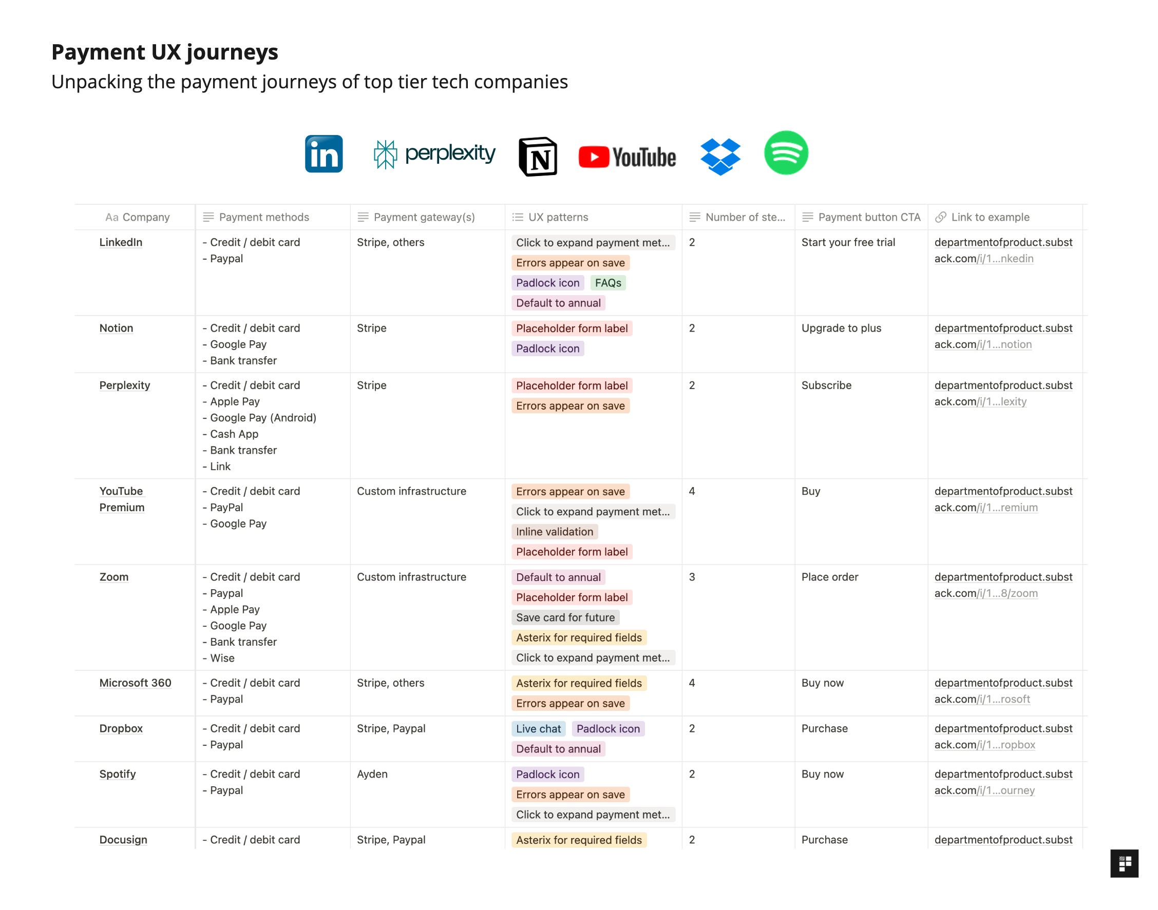
For this deep dive, we’ve hand picked a selection of top tier companies including LinkedIn, Notion, Perplexity, Zoom, Spotify and more.
To help you get a snapshot of how each of the payment journeys work, for each company’s payment journey we’ve analysed the following attributes:
Payment methods - what payment methods does each product support?
Payment gateways - do they use Stripe, Ayden or custom infrastructure?
UX patterns - what UX elements / patterns does this journey use? We’ve broken these down into some of the more common elements to help categorize them. More on that below.
Number of steps - the total number of steps involved in the payment journey
Payment button CTA - the CTA used on the button to complete the purchase