📈Chartpack: Product conversion rates 2024
Your essential guide to landing page, ecommerce, email, freemium conversion rates and more
🔒Chartpacks are in-depth analysis of the data and trends you need to help you make stronger strategic decisions. These product-focused insights will broaden your perspective beyond your immediate environment.
If you’d like to unlock your newsletter to receive them you can do so below. Or you can find out more about what you get as a paid subscriber here.
Hi product people 👋,
One of the most brutally effective things you can do in product development is to bring people down to earth with the stark reality of conversion rates.
It can sometimes feel a little harsh but it’s necessary for grounding discussions in the real world - especially when you’re working with folks who are new to tech. Unless the people in the room understand that most of the time, over 90% of users won’t convert to whatever you’re offering, it’s difficult to assess the potential merits of new marketing initiatives, partnerships or product features.
In this Chartpack, we’ve curated the latest conversion rates for important parts of the product development lifecycle including: landing pages, lead to sale conversion rates, email and more. You can bookmark these rates and use them for when you’re next creating conversion and retention models for your own product.
Coming up:
Landing page conversion rates and the anatomy of a high converting page
Ecommerce abandonment and conversion rates
Email conversion rates
Lead to sale, MQL, PQL, freemium conversion rates
Mobile app install and conversion rates
How to calculate and boost conversion rates for each type
Full database of 50+ product tools to help you measure product conversion
PS, if you missed our previous chartpacks, related to conversion rates you can find those here:
Landing page conversion rates
Let’s start with landing page conversion rates. Before we dig into the data, it’s worth noting that a landing page isn’t necessarily a home page; product marketing teams will often develop a whole series of keyword specific landing pages for ad campaigns. These might be variations of a home page or custom-built pages designed from scratch to target that specific user. When we’re talking about landing pages, we’re referring to both those pages and homepages.
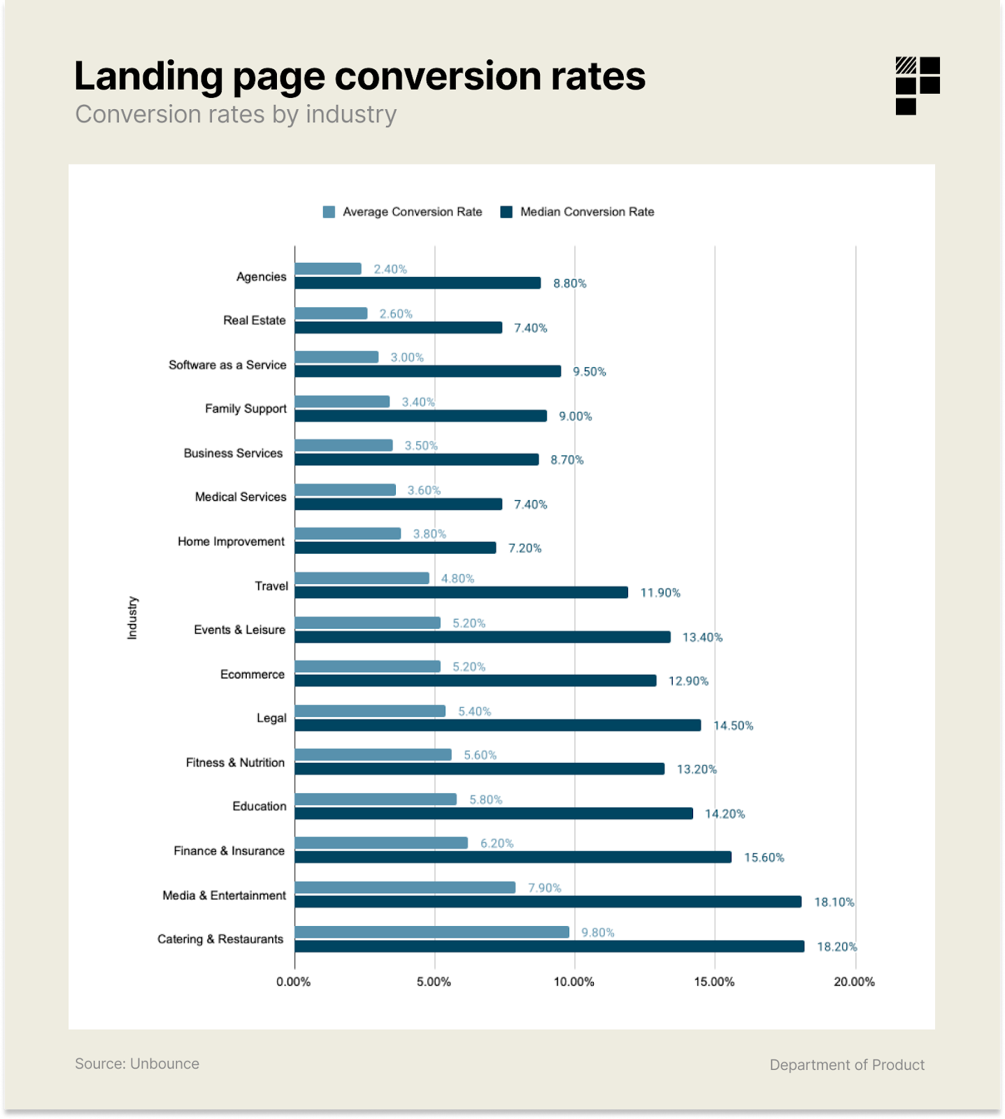
Here’s a snapshot of the various different landing page conversion rates based on the analysis of 44,000 different landing pages and 33 million conversions.
In the context of this data, a ‘conversion’ is counted as a user performing a specific desired action on that page (which can include becoming a lead, making a purchase or booking a demo).
The median conversion rate across all industries is 4.3%.
As product development teams, many of us are likely mostly interested in SaaS. For this category, you can expect an average conversion rate of just 3% or a median conversion rate of 9.5%.
How to calculate landing page conversion rates
Here’s the basic equation for calculating a landing page conversion rate:
Measuring conversions is one thing but optimising them is another. If you’re currently exploring ways to optimise your products' home or landing pages, here’s some factors to consider.
How to build a converting landing page: key elements to consider
An effective landing page should include one or more of the following elements. These will vary in their suitability depending on the nature of your product but they can be used as a trigger to experiment with.
The problem - what problem are you solving?
The solution - how does your product / service solve this problem?
The target profile - what specific profile are interested in your product or services? Segment your audience into different categories and consider each of their needs individually.
The objections - what objections are your customers likely to have?
The testimonials - what do your other customers say about your product / service? How can you demonstrate that real people have used your product?
The risk reversal - what can you do to make signing up for your product / service as low risk as possible e.g. offering a 14 day money back guarantee?
The uniqueness - what’s unique about your particular product or service vs. your competitors? How can you bring this to life?
The action - how will you turn visitors into leads / customers? What’s the call to action for doing this?
A combination of an excellent copywriter coupled with a strong UX designer can transform the performance of a landing page. This recent piece on the performance of the importance of CTA text like “book a demo” on conversion gives you a flavour of how a simple CTA change can impact demo conversions, for example.
I once worked with a CEO who requested that the designer should “make the buttons more button-y”. The product / engineering team laughed a little when they picked up the Jira card entitled “make the buttons more button-y” but the crux of the request was to make it clear which elements on the page were buttons. The designer had opted for oddly shaped buttons which were meant to look like speech marks but conversion rates were terrible. After the change, conversion shot up.
This was an important lesson for everyone about balancing beauty and utility in landing page design.
Beauty vs utility: some inspiration for your product
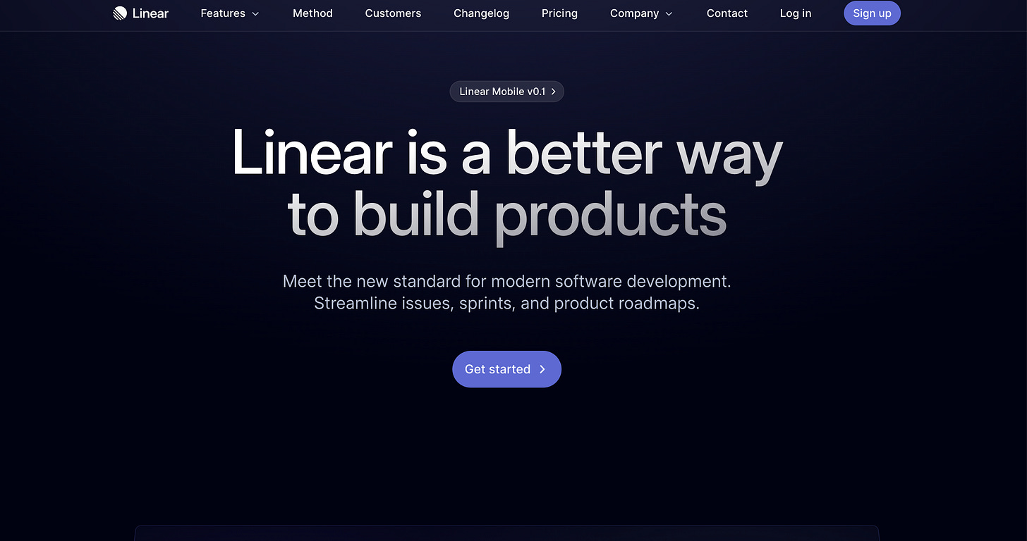
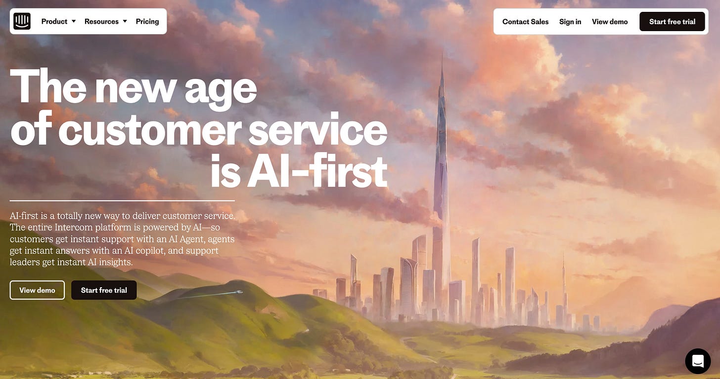
Some of the most recently lauded examples of homepages include the latest Intercom homepage and any page built by Linear.

These companies have managed to effectively combine strong, creative design principles with solid UX but they also have the benefit of targeting tech savvy users (namely product development teams or SaaS businesses).
New design trends for beautiful home and landing pages
Here are some design trends currently being deployed by top tier tech companies on their landing pages and design principles in general:
Handwritten notes and typography to convey a sense of human-centricity (Intercom’s latest page has touches of this)
Dark modes and darker colors (Linear, OpenAI)
High contrast, pill-style navigation
Skeuomorphism (Arc browser)
The problem with trends, of course, is that they constantly change. And if you’ve decided to jump on board the latest design trend, do so in the knowledge that it’s highly likely that in the next few years you’ll need to update it to make it feel less dated.
Take a look at this:
These illustrative styles were cutting edge 5-6 years ago. Now, they’re not - and using this style could have the opposite effect of making your product feel dated which indirectly impacts conversion.
If branding and beauty is important to your strategy then it’s probably worth investing heavily in the little touches that elevate your landing pages. But if your product isn’t differentiating itself based on design or branding, it’s probably best to stick to fundamentally strong UX principles instead.
Landing page testing strategies
Marissa Mayer famously tested 41 shades of blue to determine which ones users were more likely to click on. For high traffic sites, testing can deliver important percentage uplifts in conversions but for smaller teams and companies without the resources of Google it might not be possible to test the same
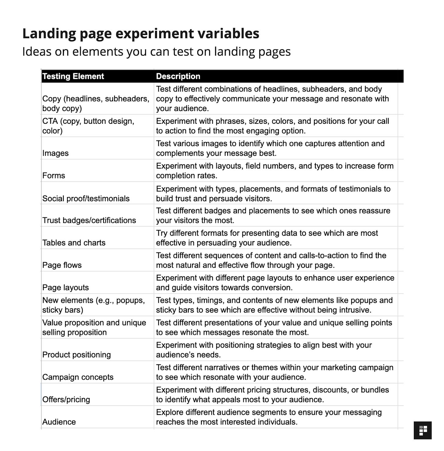
We won’t dive too deeply into this but before we look at the next category, if you’re considering running tests on your landing pages, here’s some of the most impactful variables you can test:


